Michael Riley
The Back-Up Plan
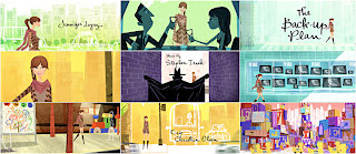
In order for me to start generating some ideas I started to look into some designers and studios and I’ve come across a few that have really caught my eye. The first designer that I looked into and really liked was Michael Riley who created the title sequence for films such as The Back-Up Plan, Kung Fu Panda and Mad Money. I particularly liked the title sequence to The Back-Up Plan, you could see by the choice of colour used that it’s going to be a fun film because of the bright colours. There was no use of dull or dark colours so as the viewer you know it’s not going to be a horror film or a thriller. Also the choice of music is very cheerful yet again implying that the film it going to be fun rather than scary or mysterious. I also liked how the designer would change little bits of the animation so that it would relate to the storyline for example there’s an animation of a police officer blowing his whistle but when the main character looks at him the whistle would change into a dummy, telling us as the audience that the film possibly has something to do with babies. I was interested in the way that Michael Riley has put this animation together and now I want to start creating my own sketches that I could possibly use later in my own animation.
'The Back-Up Plan' is distributed by the film company 'CBS Films', and produced by the studio Escape Artists Production and Michael Riley was the designer of this particular opening sequence.
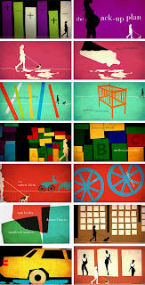
This was actually Michael’s final idea but as a designer he has to give the client options so Michael did many other designs which included:
By having all these options and ideas your able the pick the best or maybe even combine a few ideas together and this is what I will do in order to make my title sequence to the best of its ability.
Kung Fu Panda
Another one of Michael Riley title sequences that I enjoyed was Kung Fu Panda. Michael Riley kept with the theme of Kung Fu. He did this with the choice of music as he picked ‘Kung Fu Fighting’ by ‘Carl Douglas’ also the cast members name where written in Chinese in a traditional red stamp look. All these little touches kept the title sequence consistent and it gave the title sequence a theme by putting all these things together.
I viewed the title sequence of Kung Fu Panda on the website ‘Forget the Film Watch the Titles!’ (http://www.watchthetitles.com/articles/0072-Kung_Fu_Panda). You can see by this screenshot how Michael Riley has used the red stamp and the Chinese writing. Also by the uses of the colours red and oranges you can tell that it’s a warm and light hearted film and also a comedy.
Jamie Caliri
Lemony Snicket’s: A Series of Unfortunate Events
Jamie Caliri is another designer whose work I found interesting and the particular opening title sequence I enjoyed was Lemony Snicket’s: A Series of Unfortunate Events. I found this title sequence on the website ‘Art of the Title’ (http://www.artofthetitle.com/2007/12/21/lemony-snicket/). There are many elements to this title sequence that I enjoyed this includes:
· The use of layers of animation that overlapped, which gave the title sequence character.
· The use of colours which was mostly a colour palette of light grey’s and dark grey’s and black which gives the film a sense of mystery and adventure.
· I liked the use of different shapes used throughout the sequence.
· I also like how things would transform into other things for example the eye would turn into a Ferris wheel.
In Jamie Caliri interview he says “sometimes its simplicity that you need” I believe this to be true and I think that my production piece shouldn’t be complex especially considering the time limit I have to do it also.
United States of Tara
Another title sequence of Jamie Caliri’s that I liked was ‘United States of Tara’ he had the idea of using a popup book in order to express to the audience what the film will be about and what the main character is like.
There are many elements to this title sequence that I enjoyed this includes:
· The use of a popup book to present the opening sequence of the film.
· I liked the use of colours used throughout the title sequence and the way that you can use the paint brush strokes throughout the sequence.
· I like the way that Jamie Caliri represents the main character and gives the audience a sense of what kind of person she is without revealing too much
Here is the image of the popup book house.
Bob Kurtz
The Pink Panther
Bob Kurtz is another designer who works I enjoyed watching. The Pink Panther title sequence had a cartoon animation I liked how Bob Kurtz kept the background plain and simple and had the small animation in the foreground which help in order to keep the viewer’s eyes fixed only onto the cartoon. I think I may also do this so that by keeping the background quite simple the animation will keep the audience’s attention. Even though Bob Kurtz cartoon was quite small the viewer’s get a sense of the main character and the type of person they are.
You can see by this image that even though the background is plain your eyes are automatically drawn to the cartoon animation
Honey, I Blew Up the Kid
Honey, I Blew Up the Kid is another title sequence by Bob Kurtz that uses the simplistic option of having a plain background and some slight cartoon animation. Yet again this title sequence gives the audience a sense of the main character and the type of person they are.
As you can see the background is plain keeping the audience interested in only the cartoon animation and by the image you can see how the character are, you see that there’s a giant baby and how the caring father is trying to keep the baby doing what they love to do and that is play.
References
N/A. (2010). The Back-up Plan.
Last accessed 29th February 2012.
N/A. (N/A). Kung Fu Panda.
Last accessed 29th February 2012.
Art of the Title. (2007). Lemony Snicket’s A Series of Unfortunate Events.
Last accessed 29th February 2012.
N/A. (N/A). Lemony Snicket's A Series of Unfortunate Events.
Available: http://www.watchthetitles.com/articles/0019-Lemony_Snicket_s_A_Series_of_Unfortunate_Events.
Last accessed 29th February 2012.
N/A. (N/A). Jamie Caliri interview.
Last accessed 29th February 2012.
N/A. (2009). United States of Tara.
Last accessed 29th February 2012.
Art of the Title. (2009). United States of Tara.
Last accessed 29th February 2012.
N/A. (N/A). The Pink Panther.
Last accessed 29th February 2012.
N/A. (N/A). Honey, I Blew Up the Kid.
Last accessed 29th February 2012.


