Monday, 14 November 2011
Sunday, 13 November 2011
Aliasing and Anti-aliasing
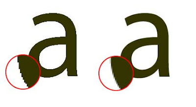
Aliasing is the visual stair-stepping of edges on an image that occurs when an images resolution is too low. Anti-aliasing is when the jagged edges of digital images are smoothed out so there's less distortion by averaging the colours of the pixels at the boundary.
As you can tell from the images they both look the same from a distance however one images is a bitmap image and the other is a vector image. The image on the left that consists of jagged edges is a bitmap image that becomes very pixelated when zoomed in. Whereas the anti-aliased image (on the right) is a vector image which is of a much higher quality and has a lot smoother finish.
The problem with bitmap images is that the image is made up of tiny squares so they never really create a smooth edge. When you zoom into the image these squares just increase in size so the image just looks worse off. As for a vector image your able to anti-alias it, this is when the curve of the image is created with squares of colours that are darker or lighter depending on how much of the curve would take up that square. Anti-aliasing adds shading along the curve to fool the eye into thinking its seeing a smoothed curve rather than a jagged bitmap image.
Mission Failed Brainstorm
The image above is a brainstorm of different ideas of what the main characters is going to be like and what the extras are going to be like. Not only that I've stated how I want the fonts and the typography to look and also the types of colour I will be using. I have also described the two different environments I will be including in my title sequence.
Mission Failed Moodboard
The mood-board that I have created above consists of all the different elements I plan to use in my title sequence. I've found images of cities and downtown streets because I want my title sequence to be based in a busy city. I've added in some bright colours that I want to use throughout my title sequence because I wanted to keep it funny, lighthearted and give it a comedic edge. I've included images of business men and muscle men to show that that's the kind of guys she's into. Not only that I've put in images of different locations that'll be in the title sequence such as the subway, her house, a taxi, a coffee shop, the gym and the city streets.
Character Sketches
I decided to go with my first idea of the desperate woman out to search for her mister right.
The sketches I have done above are of my main character and potentially the different outfits she could wear in the title sequence.
Practice Sketches
Using the Design Essentials book By Angie Taylor I started practicing some sketches. Above is the first stages of drawing an apple.
Here is the final sketch of the apple.
Yet again I looked into the Angie Taylor book for drawing in perspective. The image above is the stages of drawing an open cube in perspective.
The sketch of the eye that I have done above is to practice my shading skills.
Subscribe to:
Comments (Atom)


