
Monday, 14 November 2011

Sunday, 13 November 2011
Aliasing and Anti-aliasing
Aliasing is the visual stair-stepping of edges on an image that occurs when an images resolution is too low. Anti-aliasing is when the jagged edges of digital images are smoothed out so there's less distortion by averaging the colours of the pixels at the boundary.

As you can tell from the images they both look the same from a distance however one images is a bitmap image and the other is a vector image. The image on the left that consists of jagged edges is a bitmap image that becomes very pixelated when zoomed in. Whereas the anti-aliased image (on the right) is a vector image which is of a much higher quality and has a lot smoother finish.
The problem with bitmap images is that the image is made up of tiny squares so they never really create a smooth edge. When you zoom into the image these squares just increase in size so the image just looks worse off. As for a vector image your able to anti-alias it, this is when the curve of the image is created with squares of colours that are darker or lighter depending on how much of the curve would take up that square. Anti-aliasing adds shading along the curve to fool the eye into thinking its seeing a smoothed curve rather than a jagged bitmap image.
Mission Failed Brainstorm

The image above is a brainstorm of different ideas of what the main characters is going to be like and what the extras are going to be like. Not only that I've stated how I want the fonts and the typography to look and also the types of colour I will be using. I have also described the two different environments I will be including in my title sequence.
Mission Failed Moodboard

The mood-board that I have created above consists of all the different elements I plan to use in my title sequence. I've found images of cities and downtown streets because I want my title sequence to be based in a busy city. I've added in some bright colours that I want to use throughout my title sequence because I wanted to keep it funny, lighthearted and give it a comedic edge. I've included images of business men and muscle men to show that that's the kind of guys she's into. Not only that I've put in images of different locations that'll be in the title sequence such as the subway, her house, a taxi, a coffee shop, the gym and the city streets.
Character Sketches

I decided to go with my first idea of the desperate woman out to search for her mister right.
The sketches I have done above are of my main character and potentially the different outfits she could wear in the title sequence.
Practice Sketches

Using the Design Essentials book By Angie Taylor I started practicing some sketches. Above is the first stages of drawing an apple.

Here is the final sketch of the apple.

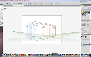
Yet again I looked into the Angie Taylor book for drawing in perspective. The image above is the stages of drawing an open cube in perspective.

The sketch of the eye that I have done above is to practice my shading skills.
Monday, 31 October 2011


Logo Design Ideas

Here I have experimented on Adobe Illustrator to create some potential logo designs that I could use in my title sequence.

Monday, 17 October 2011
More illustrator drawings...
Here I was experimenting with the blob-brush again to see what I could create.

Practicing Illustrator
In order to get use to using illustrator I began to look at tutorials online so that I'm able to learn about the different tools you can use and effects that you can create. Here are some of the things I have done:


For the two images above I was using the the perspective grid tool to create a drawing of a coffee shop.

For this image above I started to add text and a bit of colour to my drawing by mapping flat artwork to the perspective grid.

As for this image above I started to become familiar with the blob-brush and eraser tool and I drew a few simple shapes to see what I could do.
My Own Ideas
- My first idea is to have the main character as a desperate woman who is looking for 'Mr. Right'. However she goes about it the wrong way. For my title sequence I want her character to be in silhouette and I want her behavior to be like a spy. I would then want the camera to zoom into her glasses whenever she sees a potential man and it will turn into a point of view show as if she's looking through a pair of in-fared goggle, like she's tracking him down.
- My second idea is about a really good looking guy who gets plenty of attention that decides that he wants to go find himself. That is by travelling the world and finding the most beautiful girls he can (rom-com). For title sequence the main character will be a stick figure that keeps walking along and as he's going by famous sight around the world will keep going past and so will many girls that fall head over heels in love with him.
- My third idea is about a man who's like a puppet master and he controls women, money, work and much more. For the title sequence I'm going to have a real person holding puppet strings and as the camera tilts down you'll see him controlling everything and everyone.
Designers and Studios - Research
In order for me to start generating some ideas I started to look into some designers and studios and I’ve come across a few that have really caught my eye. The first designer that I looked into and really liked was Michael Riley who created the title sequence for films such as The Back-Up Plan, Kung Fu Panda and Mad Money. I particularly liked the title sequence to The Back-Up Plan, you could see by the choice of colour used that it’s going to be a fun film because of the bright colours. There was no use of dull or dark colours so as the viewer you know it’s not going to be a horror film or a thriller. Also the choice of music is very cheerful yet again implying that the film it going to be fun rather than scary or mysterious. I also liked how the designer would change little bits of the animation so that it would relate to the storyline for example there’s an animation of a police officer blowing his whistle but when the main character looks at him the whistle would change into a dummy, telling us as the audience that the film possibly has something to do with babies. I was interested in the way that Michael Riley has put this animation together and now I want to start creating my own sketches that I could possibly use later in my own animation.
'The Back-Up Plan' is distributed by the film company 'CBS Films', and produced by the studio Escape Artists Production and Michael Riley was the designer of this particular opening sequence.

This was actually Michael’s final idea but as a designer he has to give the client options so Michael did many other designs which included:


By having all these options and ideas your able the pick the best or maybe even combine a few ideas together and this is what I will do in order to make my title sequence to the best of its ability.
Kung Fu Panda
Another one of Michael Riley title sequences that I enjoyed was Kung Fu Panda. Michael Riley kept with the theme of Kung Fu. He did this with the choice of music as he picked ‘Kung Fu Fighting’ by ‘Carl Douglas’ also the cast members name where written in Chinese in a traditional red stamp look. All these little touches kept the title sequence consistent and it gave the title sequence a theme by putting all these things together.

I viewed the title sequence of Kung Fu Panda on the website ‘Forget the Film Watch the Titles!’ (http://www.watchthetitles.com/articles/0072-Kung_Fu_Panda). You can see by this screenshot how Michael Riley has used the red stamp and the Chinese writing. Also by the uses of the colours red and oranges you can tell that it’s a warm and light hearted film and also a comedy.
Lemony Snicket’s: A Series of Unfortunate Events
Jamie Caliri is another designer whose work I found interesting and the particular opening title sequence I enjoyed was Lemony Snicket’s: A Series of Unfortunate Events. I found this title sequence on the website ‘Art of the Title’ (http://www.artofthetitle.com/2007/12/21/lemony-snicket/). There are many elements to this title sequence that I enjoyed this includes:
· - The use of layers of animation that overlapped, which gave the title sequence character.
· - The use of colours which was mostly a colour palette of light grey’s and dark grey’s and black which gives the film a sense of mystery and adventure.
· - I liked the use of different shapes used throughout the sequence.


Here you can see how the eye turn into a Ferris wheel.
·
Motion Graphics Brief
As a part of my motion graphics module (EE2212), we had the option of two different briefs that we had to fulfil. I myself chose the second brief which is to create a film title sequence which should last up to 2 – 3 minutes long. My title sequence has to consist of two “environments” that I must transition between but the cast members names will have to run over both, which only means that the style will have to work with both environments. I will have to pick my own worlds and work on putting the two together as visually seamlessly as possible. Also the text and cast name must be made to be replaced if the client was to want something to be changed as in the real world things would change on a daily basis.
Subscribe to:
Comments (Atom)